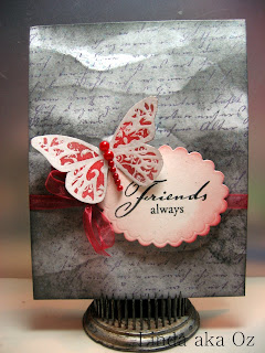
When I posted this card on my Flickr group, I received a lot of requests for a video. Now wouldn't that be cool! Yeah I would love to do a video, more than one even. But.... I don't have a camera that will do video except for my cell phone and it was pretty lame. Yes I tried it.
So, in a effort to make myself expand and learn while I am saving up for a video camera, I have put together a tutorial. This is my first ever online tutorial, but since it is also my first ever blog...I say what the heck.. go for it!
 I started out with a plan white card base, this happens to be A2 but size is not important. A piece of thin copy or printer paper (tear a strip off) and black ink. Ranger's Distress ink will work also but remember it is formulated to stay wet longer so it is even messier than pigment or dye ink.
Don't forget the application tool. For this I use a piece of makeup sponge. You can use a dried out wipe-up, piece of cloth, felt or purchased foam applicator. All of these will work but I like the make-up wedges just fine.
 With something protecting your work surface (I use the rest of the copy paper) lay your torn strip across the top of your card base. I dab the sponge onto the ink pad and blot off a bit (look at the rectangle at the top right corner of this pic) just to keep from getting to strong of a line on my card face. Then with a wiping across action, I just basically swipe the sponge across the copy paper and onto the card face.
This pic shows the torn edge of the copy paper moved down a bit after I have finished my first row on the card face. Move the torn edge side to side and tilt a little as you work down the card. This will give you more visual interest.
 Here you can see where I have worked my way down about a quarter of the way on the card base. I am only using one color of ink but I have achieved all these light and dark shades. I am doing nothing special. Each time I move the torn paper I dab in the ink, blot off a bit and then starting at one side, swipe across the torn paper onto the card base. That's it.
 This is the entire card face completed with this method. Can you see the highs and lows, where it almost looks quilted? It is completely flat but it really does look like puffed up clouds. You do not have to use black, any ink color will do.
 My next step is to mist with Perfect Pearls or Perfect Sparkles in water. This mister was purchased at Walmart for 50 cents. I then added water and some bronze Perfect Pearls. It has never clogged and has lasted me for ages. I use it a lot too. If left alone I would more than likely mist everything within reach as it leaves such a lovely soft glimmer on the surface... hey wait, I live alone, I can glimmer anything I want! Where is that cat?

After letting the glimmery mist dry, you can then stamp, glue, write upon or even spill pop (soda) on it if you want. Since you never tear your paper the same way twice, your backgrounds will be so different each time. The fact that they are different but never disappointing is what makes me a huge fan of this technique.
I swear these cards were never wrinkled, folded, creased or cussed at in any way! Cross my heart! What ever dimension you see is purely trick of the eye!
I so hope you have not only enjoyed this tutorial but that I made it understandable. Please take a moment and let me know. I can only improve with knowledge and practice...
Till next time, ENJOY! the Oz
 "The soft glow of the moon caused her to cast misty shadows on the grave sites of lost loved ones as she walked through the grave yard. She had no purpose for being there, yet somehow compelled to continue on."


